Quick Hits: The Good, the Bad, and the Ugly
In this round of Quick Hits, I am clearing out the backlog. Some of these items have been up for review for more than a year and invariably more interesting and topical reviews get in their way. Some of these items are quite good, just not that complex. But most of the stuff here is absolute dreck--the worst of the worst. Without further ado...
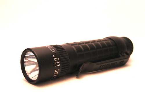
My son loves playing around with my flashlights, blinding myself and his mother, shining them on things out the window, and playing shadow puppets. He has a favorite (the SPY 007, as it fits is hand well and he can use the rotary UI easily) and one he hates. Its the Mag Tac. And his reason for disdain is a perfect example of bad design. Its so bad, even a toddler gets it. The Mag Tac has a momentary on switch, but its terribly designed. If you press the clicky once, you get a momentary on. In order to turn the light on you need to click twice. EPIC FAIL. The main function of a device should never been hidden, should never be unintuitive, and should never take a back seat to a secondary feature. NEVER. Donald Norman died a tiny bit when Mag decided to use this UI.
All of this skips over the fact that Mag Light is a company with a reputation for viciousness. Their cease and desist letters for intellectual property are something of legend in the flashlight world--legally bullying companies from all sorts of innovations. Here is a telling quote:
"In 1987 the company won $3.1 million in a copyright infringement suit against Streamlight, Inc. Another judgment soon followed against Kassnar Imports, Inc. ($2.75 million, 1989) and The Brinkmann Corporation ($1.2 million, 1990). More imitations by potential competitors--some 50 different companies around the world--would follow. Mag spent $17 million from 1986 to 1989 to fight cheap knock-offs. This was more than three times the company's advertising budget, noted the Wall Street Journal."
But all of this stems from the owner himself--a man that seems to thrive on litigation. I don't normally get into the politics of a company, but when it is as bad as Maglight, everyone deserves to know. I know Mag is the quintessence of American manufacturing and the standard flashlight for 99% of people, but the company is the corporate citizen equivalent of gangland boss--a ruthless persona that makes lots of money by bullying others.
Fortunately for folks like us, none of this matters, as their products are garbage, 30 years behind the curve and even the MagTac, their "latest" light is still 10 years behind the times.
Overall Score: 9 out of 20; 2 off for Design; 2 off for a chintzy feel to just about everything, but the body tube; 1 off for Output thanks to a disco-esque beam tint; 2 off for carry for the bizarro and bulky clip; 2 off for the worst UI on the planet; 1 off for Beam Type for a weirdo, neither flood nor throw beam; and 1 off for Beam Quality for some imperfections.
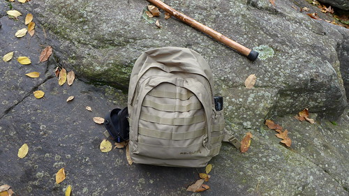
This is either a poorly designed backpack or an osteoporosis simulator, designed to help you understand and empathize with the back pain old people must deal with on a daily basis. When these packs came out the Internet was abuzz with the idea that you could get a Maxped-like design for $15 at Wal-Mart. However, like almost all things in life, you get what you pay for, though I am not sure that folks that bought this pack intended to purchase $50 worth of back pain, along with $15 worth of backpack. As you can see, the math is not quite that good--this is really a $65 pack when you consider how much your pain is worth.
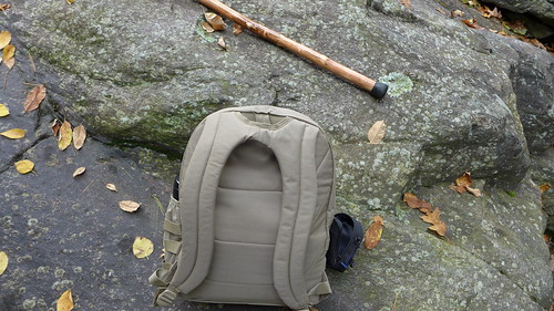
The problem comes from the way that the shoulder straps and back panel are put together. They have a huge space between the top of the pack and your back and the result is the back hangs incredibly awkwardly on your back. It might be fair to say that this is the worst carrying pack I have ever used. Minutes with the pack produced noticeable pain. Like not grimacing or discomfort like the Topo Designs Daypack, but actual, reaching-for-the-Tylenol pain.
The zippers are bunk, too meshing poorly in 1 out of 5 uses. The organization isn't bad, leagues better than the Topo Design Daypack, but the materials are noticeably poorer.
The MOLLE, of course, works because it is simple in principle and cheap in implementation even on the fanciest bags:
This thing is a big fat don't bother. The price lures you in, but the humpback will repel you away after even a few minutes of use.
Overall Score: 10 out 20, better than the Topo Designs Daypack (which matches my intuitive experience of the bags); 2 off for sloppy stitching and the like throughout, 2 off Carry for crippling pain due to the horrid strap layout, 2 off Materials for uber thin fabric and liners, 1 off Accessibility for only okay reach in and grab stuff pockets, 1 off Snaps/buckles/zippers for regularly misthreading zippers, 2 off Straps and Belts for the worst shoulder straps I have ever seen--these things were stuffed with tissue paper or something.
Sharpie Pen (Metal Body)

Want to see the practically perfect Big Box office supply pen? This is it. The barrel is sturdy, the page feel is outstanding, the ink is bold without bleeding, and unlike a lot of Big Box pens, this one has replaceable refills, and a great, grippy section. The Sharpie ink is worth a mention here--it is exceptionally bold and crisp, but doesn't bleed or feather in the least. The page feel of writing with this pen is quite impressive, almost fountain pen-level addictive. There is a Sharpie clicky, but I haven't found one with a metal body and replaceable refills. I like this pen almost as much as the modded Zebra F-701. If it was a clicky, it just might be the perfect budget pen. I can't really draw this out anymore to say that this is a great, cheap pen. Buy two and a handful refills and you'll be pleased. As a loaner they are great. Also, in home improvements, they are superb as marking pens--appearing bold on drywall and wood.
Overall Score: 19 out of 20; 1 off Design for the sometimes postable cap.
Mag Light MagTac

My son loves playing around with my flashlights, blinding myself and his mother, shining them on things out the window, and playing shadow puppets. He has a favorite (the SPY 007, as it fits is hand well and he can use the rotary UI easily) and one he hates. Its the Mag Tac. And his reason for disdain is a perfect example of bad design. Its so bad, even a toddler gets it. The Mag Tac has a momentary on switch, but its terribly designed. If you press the clicky once, you get a momentary on. In order to turn the light on you need to click twice. EPIC FAIL. The main function of a device should never been hidden, should never be unintuitive, and should never take a back seat to a secondary feature. NEVER. Donald Norman died a tiny bit when Mag decided to use this UI.
The light itself is okay. The plastic clip is a bit weird and the "lens" is nothing more than thin sheet of plastic.

The body tube, like all Mag lights, is great, but everything else not just below par, but worse than all but the crappiest bargin bin, Black Friday specials. Simply put, despite the 300 lumen output and use of real batteries and emitters, the Mag Tac is still out of date.
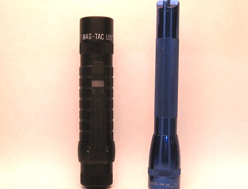

The body tube, like all Mag lights, is great, but everything else not just below par, but worse than all but the crappiest bargin bin, Black Friday specials. Simply put, despite the 300 lumen output and use of real batteries and emitters, the Mag Tac is still out of date.

All of this skips over the fact that Mag Light is a company with a reputation for viciousness. Their cease and desist letters for intellectual property are something of legend in the flashlight world--legally bullying companies from all sorts of innovations. Here is a telling quote:
"In 1987 the company won $3.1 million in a copyright infringement suit against Streamlight, Inc. Another judgment soon followed against Kassnar Imports, Inc. ($2.75 million, 1989) and The Brinkmann Corporation ($1.2 million, 1990). More imitations by potential competitors--some 50 different companies around the world--would follow. Mag spent $17 million from 1986 to 1989 to fight cheap knock-offs. This was more than three times the company's advertising budget, noted the Wall Street Journal."
But all of this stems from the owner himself--a man that seems to thrive on litigation. I don't normally get into the politics of a company, but when it is as bad as Maglight, everyone deserves to know. I know Mag is the quintessence of American manufacturing and the standard flashlight for 99% of people, but the company is the corporate citizen equivalent of gangland boss--a ruthless persona that makes lots of money by bullying others.
Fortunately for folks like us, none of this matters, as their products are garbage, 30 years behind the curve and even the MagTac, their "latest" light is still 10 years behind the times.
Overall Score: 9 out of 20; 2 off for Design; 2 off for a chintzy feel to just about everything, but the body tube; 1 off for Output thanks to a disco-esque beam tint; 2 off for carry for the bizarro and bulky clip; 2 off for the worst UI on the planet; 1 off for Beam Type for a weirdo, neither flood nor throw beam; and 1 off for Beam Quality for some imperfections.
Fieldline Backpack

This is either a poorly designed backpack or an osteoporosis simulator, designed to help you understand and empathize with the back pain old people must deal with on a daily basis. When these packs came out the Internet was abuzz with the idea that you could get a Maxped-like design for $15 at Wal-Mart. However, like almost all things in life, you get what you pay for, though I am not sure that folks that bought this pack intended to purchase $50 worth of back pain, along with $15 worth of backpack. As you can see, the math is not quite that good--this is really a $65 pack when you consider how much your pain is worth.

The problem comes from the way that the shoulder straps and back panel are put together. They have a huge space between the top of the pack and your back and the result is the back hangs incredibly awkwardly on your back. It might be fair to say that this is the worst carrying pack I have ever used. Minutes with the pack produced noticeable pain. Like not grimacing or discomfort like the Topo Designs Daypack, but actual, reaching-for-the-Tylenol pain.
The zippers are bunk, too meshing poorly in 1 out of 5 uses. The organization isn't bad, leagues better than the Topo Design Daypack, but the materials are noticeably poorer.

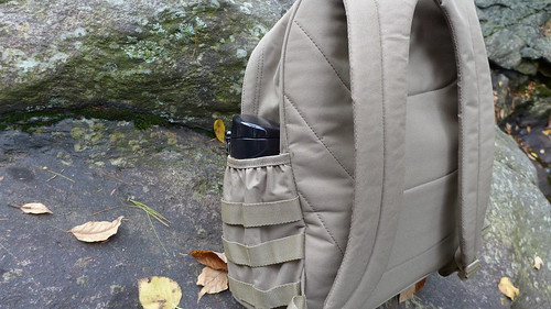
The MOLLE, of course, works because it is simple in principle and cheap in implementation even on the fanciest bags:

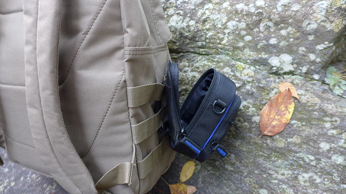
This thing is a big fat don't bother. The price lures you in, but the humpback will repel you away after even a few minutes of use.
Overall Score: 10 out 20, better than the Topo Designs Daypack (which matches my intuitive experience of the bags); 2 off for sloppy stitching and the like throughout, 2 off Carry for crippling pain due to the horrid strap layout, 2 off Materials for uber thin fabric and liners, 1 off Accessibility for only okay reach in and grab stuff pockets, 1 off Snaps/buckles/zippers for regularly misthreading zippers, 2 off Straps and Belts for the worst shoulder straps I have ever seen--these things were stuffed with tissue paper or something.
Sharpie Pen (Metal Body)

Want to see the practically perfect Big Box office supply pen? This is it. The barrel is sturdy, the page feel is outstanding, the ink is bold without bleeding, and unlike a lot of Big Box pens, this one has replaceable refills, and a great, grippy section. The Sharpie ink is worth a mention here--it is exceptionally bold and crisp, but doesn't bleed or feather in the least. The page feel of writing with this pen is quite impressive, almost fountain pen-level addictive. There is a Sharpie clicky, but I haven't found one with a metal body and replaceable refills. I like this pen almost as much as the modded Zebra F-701. If it was a clicky, it just might be the perfect budget pen. I can't really draw this out anymore to say that this is a great, cheap pen. Buy two and a handful refills and you'll be pleased. As a loaner they are great. Also, in home improvements, they are superb as marking pens--appearing bold on drywall and wood.
Overall Score: 19 out of 20; 1 off Design for the sometimes postable cap.
Gerber 600
If anyone wants to see why Gerber has failed to make products worth spending money on, they need to look no further than the company's standard bearer multitool, the 600. It is a wretched, rattletrap, finger pinching piece of junk. The only way to make it worse would be to make it out of some sort of radioactive metal, one that slowly gives you testicular cancer over time (guys, check yourself before you wreck yourself).
If anyone wants to see why Gerber has failed to make products worth spending money on, they need to look no further than the company's standard bearer multitool, the 600. It is a wretched, rattletrap, finger pinching piece of junk. The only way to make it worse would be to make it out of some sort of radioactive metal, one that slowly gives you testicular cancer over time (guys, check yourself before you wreck yourself).
The one hand design is good, but as implemented by Gerber it leads to a rickety mess. The knife blade is just wobbly and the blade steel is well below butter knife standards. The jaws of the pliers are imprecise and the handles are very uncomfortable. Quite literally there is nothing good about the Gerber 600.
I have owned this junk pile for more than a decade and after a few years of pinching me every I used it, I gave it to my wife's lab students. After five or so years, they gave it back. These are people that need and use tools every minute of every day. They need pliers to grab hot plates and open compressed tanks of gas. They need something to loosen frozen or corroded bindings and hose clamps. Apparently they too were tired of this medieval torture device that is sold as a multitool, because they gave it back. They'd rather burn and freeze their hands than use this thing. This is clearly the worst thing I have ever reviewed. Even the bulky, oven mitt sheath that my very old 600 came with is putrid. It is so bulky and the fabric is so textured that it is impossible to pull out of pants and a challenge to get out of a bag.
There is a strong and compelling argument that the 600 is a perfect example of the flaws in a patent system like ours. Two years ago the one hand opening patent ran out and the Leatherman OHT hit the market. It is a superior tool in every regard. And thus, if by dumb luck, someone stumbles on a great idea, but can't make it bear fruit, you have to suffer for 20 years (really 17) until that dullard's patent runs out and someone else can make it, or you have to license the patent, but on multitools with their already small margins, that is impractical. Look at that, I found something interesting to say about the Gerber 600. I guess even shit can be interesting.
Overall Score: 1 out of 20. 1 positive point for Design because of the innovative the one hand deployment that sorta kinda sometimes works; 0 in everything else--this thing is awful.
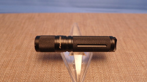
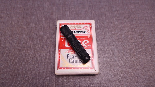
In many ways, the E05 2014 edition, is both the simplest and best Fenix light I have seen. Fenix was the vanguard of the first competitive wave of Chinese LED flashlights, lights that could stand up to a Surefire in terms of build quality and performance. Over the years they have gone from the role of value-first innovator to the epitome of feature creep. Switches, buttons, clips, twist heads, accessories--they all piled up as up and coming companies passed Fenix by in terms of core performance. Hi CRI emitters, selector ring UIs, and better build quality allowed Eagletac, Thrunight, Sunwayman, and the Sysmax brands to pass Fenix by. This is one of the reasons I have review so few Fenix lights.

But the E05 skips all of the baloney and goes for a solid design over silly, worthless accessories. The light is positively microscopic compared to something like the Peak Eiger, but it crams a bunch of good stuff in the light including a Total Internal Reflector, a simple twisty interface, and a great tailcap design. There is not a Hi CRI emitter inside, but pretty much everything else here is top shelf. And, amazingly enough, the E05 2014 edition can be found for a bargain basement price. I got the review sample (which I purchased as a Christmas present for my son) for under $20 on Black Friday. The normal price is around $25. Additionally there is a polished version, a special edition, that costs much more.
You'd be hard pressed to find a better keychain light and though it is short a few high end features, its overall tiny footprint puts it on par with the Eagletac D25 AAA.
Overall Score: 17 out 20; 1 off UI for the fiddly twisty UI (its hard to do twisties on a light this small) and 2 off Beam Quality for the dance club tint.


